
In this tutorial, we're going to teach you how to combine multiple stock photos into a single, coherent scenery in Photoshop. We'll start off with a single panoramic photo, and integrate two others along the way. Also, we'll look at ways to make the final result look more dynamic and appealing with a few adjustments layers. If you're looking to improve your photo manipulation skills, this tutorial should prove very useful!
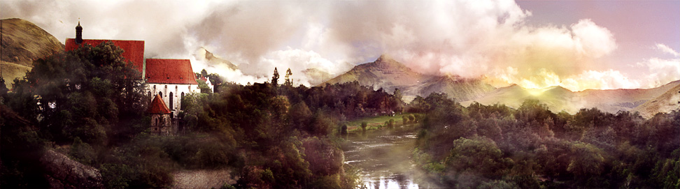
Final Image Preview
Take a look at the image we'll be creating.
Tutorial Details
- Program: Photoshop
- Version: CS3
- Difficulty: Intermediate
- Estimated Completion Time: Approximately 3 hours
We will change this photo:


Into something like this:
Let´s download the main picture first of all, which belongs to pelleron-stock's deviant art account. Also, you'll need some mountains (here and here) in the background. These belong to Momotte2stocks.
Step 1 - Replacing The River
When I was creating this photo manipulation I wanted to do a really wide format. In the next few steps, I will show you how to replace some elements to make your picture wide as well. But if you don´t like this format, feel free to skip these few steps.
Open the main photo. Press L ( Lasso Tool) and select the river and some trees around it. You don´t need to be too careful because we'll retouch all parts later.


Press Command + C to copy the selection and Command + V to paste it as a new layer. Name the layer RIVER and move it higher than it was before.
Crop the picture. You should get something like this:


Now add layer mask (the Add Layer Mask button can be found on the bottom part of the Layers palette) to the RIVER and start blending layers together. To do that, press B ( Brush Tool), select a soft round brush, pick black as foreground color and paint over the areas of the RIVER, that you want to be hidden. To be precise, use a smaller brush and use lower opacity to get a more realistic result.
You should end up with something like this:


Step 2 - Replacing the Monastery
Click on the layer with main background. Press L (Lasso Tool) and select the monastery. Press Command + C and Command + V to paste the monastery as a new layer. Name it MONASTERY. Now press Command + T and make the building a little smaller.
Then add layer mask to the MONASTERY and blend it as you did it in the previous step. You can also crop the picture as I did it. After that, you should have an image similar to this one:


Step 3 - Retouching
In this step we will retouch all the unwanted houses and the wall. To do that use the Stamp Tool. Be as careful as possible because the more attention yuo pay here, the more realistic the picture will look.
I will not explain how to use the Stamp Tool since this is not a tutorial for beginners but those of you who aren´t familiar with this useful tool you can look at this tutorial. Below you can see gif animation showing how I removed all the houses:


Step 4 - Retouching The Foreground
As you can see there are still some houses in the foreground. To remove them we will use one little trick. Open the photo of the main background and while using the Lasso Tool, select the red bordered part of the photo and drag it into your photo manipulation.


Place the stone as you can see bellow:


Name the layer FOREGROUND and add a layer mask to it. While using a soft, round brush with black color, blend in the layer with the rest of the picture.
Step 5 - Adding Mountains
In this step we will add mountains to the background. At first the white sky has to be removed. To do it press W (Magic Wand), set Tolerance on 30 and click on the sky. To make a more accurate selection, go to Select > Refine Edge, and set the menu as you can see bellow:

Then delete the selection - simply press Delete.
Open pictures with mountains and drag them into the photo manipulation. Put them under the layer with the main picture and place them as can be seen on the final picture. Name layers LEFT MOUNTAIN and RIGHT MOUNTAIN and blend them together while using layer masks, just as we did it in previous steps. Below you can see the final result of this step:


Step 6 - Fixing Brightness
Nature objects which are closer to us, seem to be darker than the ones in the distance. As you can see in the picture above, our image is lighter in the front and darker in the distance which is wrong and doesn´t look realistic. We will fix it now.
At first, make the mountains lighter. Add a new adjustment layer (Levels) to both mountain layers - LEFT MOUNTAIN and RIGHT MOUNTAIN. Set the Input Levels on 0; 1,56; 255 and press OK. Don´t forget to create clipping masks from the adjustment layers to affect only one layer bellow. You should get something like this:


Now it´s time to make the middle and front darker. Add adjustment layer Levels to layer with the main picture, RIVER, MONASTERY and FOREGROUND. Set the Input Levels on 54; 0,68; 235. Create a clipping mask for them. Your picture will look like this one:


Step 7 - Adding Mist
To create the right magical atmosphere, we will add mist around the river and mountains. Download a fog brush (I used this one) and install it into Photoshop. If you don´t know how, look at this tutorial.
Now add new layer above LEFT MOUNTAIN and RIGHT MOUNTAIN but bellow the layer with main picture and name it MIST ARROUND MOUNTAINS. Press B (=Brush Tool), select your mist brushes, pick white color and start painting the mist. You can change opacity or try to change Blending Mode to get more realistic result.
Once you´re done with mist around the mountains add new layer above all the layers and name it MIST ARROUND RIVER. Paint some fog again.


It´s amazing how one simple brush can totally change the atmosphere of picture.
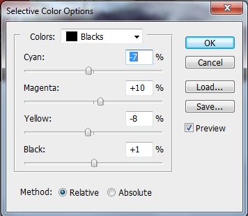
Step 8 - Reddish Tones
Because we are creating a landscape during sunset, the picture should have warmer tones. To fix it, add a Selective Color adjustment layer on the top of your layers and set it as you can see below:
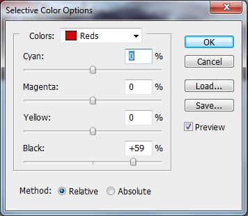
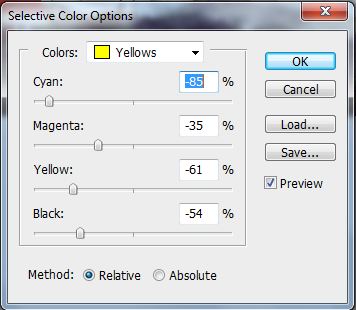
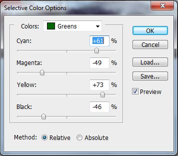
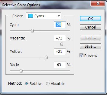
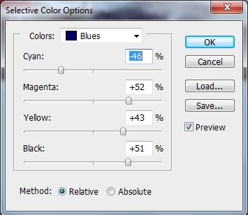
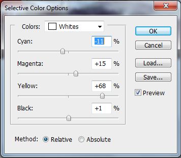
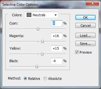
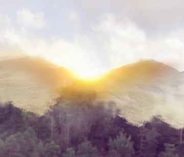
Your picture should look like the one bellow:


Step 9 - More Retouching
Press S ( Stamp Tool) and analyze your manipulation once more to see if everything is retouched properly. For a different take, flip the canvas horizontally. Mistakes will show up easily. In my case I forgot to retouch part of the wall below the monastery. I also covered some small details. You should zoom on 100% to see mistakes better.


Step 10 - Adding Sunset
In this step we will add sunset. To do that, add a new layer above all the layers and name it SUNSET. Press B ( Brush Tool), pick some yellow/orange color and paint something similar to what can see on the picture bellow:

Notice that parts which are closer to the sun are more saturated. To paint it realistically, you can look at some photo references on the internet.
Now add new layer again and name it for example COLORS OF SUNSET. Press B to activate BRUSH TOOL, select some soft round brush, pick some red or pinkish color, lower the opacity to about 20% and paint a red circle around the sunset. Then pick an orange color, make the diameter of the brush smaller and paint an even smaller circle. And finally make the brush smaller once again and paint one small yellow circle. Change the Blending Mode of the layer on Color. In the pictures bellow you can see exactly what I mean.


Add new adjustment layer Hue/Saturation above all the layers and set the value Saturation on -35. Press OK.
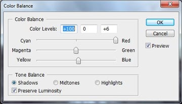
Now we will add some more colors from the sunset. Add new adjustment layer Color Balance on the top of all layers and set the values as you can see bellow:
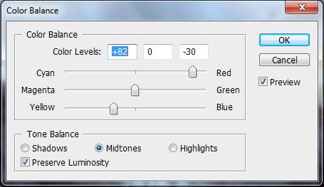

Press G (Gradient Tool), pick a black color and fill the layer mask of the adjustment layer with it.

Now press B to activate Brush Tool, pick a white color, choose a small diameter and paint over the areas which should be reddish because of the sun. Below you can see where I painted:


Step 11 - Adding Light
It´s time to add light from the sun. Create new layer above all the layers and name it LIGHT FROM SUN. Press B (Brush Tool), pick some yellow color, choose a small diameter for the brush and lower the opacity. Now start painting over the areas which should be lighter because of the sun.
Below you can see result of this step and also exactly what I painted to know what to do.


The trees that are closer to the horizon should be more yellow.
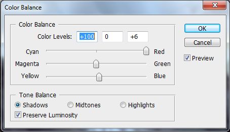
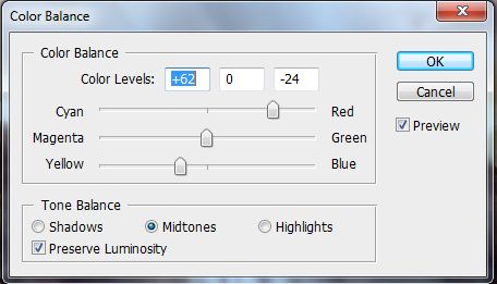
Now add new adjustment layer Color Balance on the top of all layers and set it as you can see below:

Your result should be similar to this one:


Step 12 - More Lights And Shadows
Add a new layer on the top of all layers and name it LIGHTS AND SHADOWS. Press G (= Gradient Tool) and fill the layer with solid grey (#808080). Change the Blending Mode to Overlay. Press B (Brush Tool), pick black or dark grey and start painting over the areas where there should be shadows. Then pick a white color and paint where lights should be.


As you can see this layer adds much more plasticity to the picture.
Now add one more layer on the top. Name it GLOBAL LIGHT, fill it with solid #808080 grey and change the Blending Mode on Overlay again. Press B (Brush Tool), choose some big soft brush and pick white color. Lower the opacity to about 20% and paint some white around sun. Then pick black color and paint over areas which are away from the sun.
Your result from this step should be similar to this one:


Step 13 - Finishing Touches
We are almost done. There is only one thing left - it would be better to increase the overall contrast of the manipulation. Add a new Levels adjustment layer on top of all layers and change the Input Levels to 16; 0,79; 245.
And that's it! You can view the large version here.


