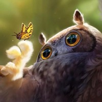
When illustrating a scene, it is important to think about several factors including lighting, depth of field, and color. You can also enhance your illustration by conveying an emotional message. In this tutorial, Therese Larsson will show you how to create a heart-warming wildlife illustration using a variety of digital illustration techniques. Let's get started!
Speed Art Video
See how this painting came together in this stunning speed art video.

1. Set Up the Base for the Painting
Step 1
Create a new document (File > New...), and pick a fairly large size. Make sure you work in 300 dpi, in case you ever want to print your art. Working bigger and then sizing down is always the way to go, since you cannot to the reverse without losing image quality.


I start off by doing a quick sketch on a new layer (Layer > New... > Layer) / (Shift + Command/Ctrl + N) where I explore the composition I want to use. This is usually not very refined at all, but I use it as a guide. I set this to multiply and lock it, so that I can freely paint under the sketch. Often I will pull down the opacity to about 50% as well, to not be too distracted by the lines when I paint.


2. Block in the Background
Step 1
Under the linework I will first quickly block in the base colour scheme for the image. In this case I want it to be a fairly dark morning but with direct light hitting the mice from behind, with moist air as if it had been raining that night. I use a soft brush to quickly block in some main structures. In this stage, I keep it very simple and only hinting at a background. My plan is to keep the background out of focus, to keep the viewer from being distracted from the main subject, the mice on the branch.


3. Building Depth and Light
Step 1
I add a new layer (Layer > New... > Layer) where I use a rather rough brush to hint at foliage closer to the viewer. I don't bother with details yet, the details are worked out much further into the process. The early stages are more about exploration, trying to step-by-step build up a scene that feels 3-dimensional. This can be very rough, so don't try to spend too much time on details yet. Try to be quick and effortless.


Step 2
To smooth out the new foliage layer I will go into Filter > Blur > Gaussian blur. Watch the preview window as you tweak the radius of the blur, as you still would want the structures of the foliage to be readable.
Once I found a level of blurring that suited me, I added a new layer (Layer > New... > Layer) and set it to Soft Light. Then I proceeded to build up an initial light with more orange morning light at the top and more blueish wet atmosphere at the bottom.
I want to play with colors that bounce off one another, so the main palette of the art will be a yellowish brown against a blueish green.


4. The Mice
Step 1
Time to block in the mice. I add a new layer (Layer > New... > Layer) and use a neutral brown base color. I choose something that is not too dark nor too light, but rather in the middle. That enables me to build light and shadow in an effective way from a good starting point.


Step 2
From this base layer, I add a new layer (Layer > New... > Layer) and link to the base colour layer by holding alt and then clicking between the two layers I want to be linked. That way anything I paint on the new layer will stay within the constraints of the base layer.
This new layer will be the initial light of mother mouse. I want the light to be rather rich and vivid, so I set the layer style to Hard Light. I paint in some orange light hitting from above and behind, and under her I paint in a more greenish-blue hue since there is a bounce light that will pick up the colours from the foliage under her and then be projected on her lower body.
Once again, keep it simple in the early stages. Details are saved for last. Once I have a base light I am happy with, I select the two layers and merge them by pressing Command/Ctrl + E or go to Layer >Merge layers. If you don't watch out, soon you will have 100 layers and you have no clue which one does what.


Step 3
Once I have a base colour and base light, it's time to start building up the forms. I add a new layer (Layer > New... > Layer) and link it to the base layer of the mouse again, and I then use a brush I am comfortable with and start to sculpt the shapes by refining the light and shadows.
I pick colors from the environment to unite the artwork. Constantly paying attention to where the light source is and how it would affect the subject. I use a normal layer style for this, trusting my skills in light and color. Use references if you are painting something you are unsure of.
Never put your entire faith in layer styles or brushes, but spend time to learn the principles of light and form. I let a lot of light hit her head to add contrast and interest, and to really bring it out from the background. Since mouse ears are usually rather thin, some of the light will shine through the flesh and make for a red glow.


Step 4
I add another layer (Layer > New... > Layer) and link it ( Alt + click between layers) to the base layer again. I set it to either Soft or Hard Light, depending on what kind of effect I want. Hard Light will have a greater impact, but needs to be used carefully to not burn out an image and make it garish. I sculpt some more orange light to add warmth to her upper body. The lower body gets another light wash of greenish blue, to unite her a bit more with the background.


Step 5
I felt that the upper background was a bit dark still, so I decided to lighten it up a bit with speckled light, as though the rays were shining through grass and leaves. I pick out a soft, round brush without any hard edges, so the background won't fight with the foreground. I am also starting to refine the tiny mice babies, by giving them the same treatment as their mother. Add a new layer (Layer > New... > Layer), then link it to the baby mouse base layer. I use a rough brush to quickly block in some basic color deviations.


Step 6
The initial light is hinted at. At this point I haven't added any hard light yet, so the light effects are still a bit dull and don't pop. It's important to think while you draw. How does the light act? Where does it come from? Will something obstruct its way?
The mouse closest to its mother will be slightly shielded from the light, so I do not add harsh light to the entire body. I leave out the head, since mother mouse is in the way and the light won't magically bend around her and create the same direct effect as on the others. Sine the tails and ears are fleshy and organic, I let some of the light enter them and create a sub-surface scattering effect, glowing slightly red.


Step 7
The branch is blocked in to create a place for them to sit as they are going to collect the morning dew. I refine the baby mice some more, and at this point I add a new layer and link it to the base, then change the layer style into Hard Light.
I carefully add orange light to the hottest spots of the mice, where the light is most intense. Still being rather cautious, as lighting is a touch and go process. I constantly ask my gut feeling if it feels good. Usually I can tell when the light is too hard or too soft, and adjust from that. Trust your instincts, if it doesn't feel right, change it. If you cannot tell if it works or not, ask a friend to quickly have a look at it. They don't have to be artists themselves, it's enough to be human and have a feeling of what looks right or not.


Step 8
I'm now starting to enter a phase where I detail more. At this point, I start to rough up the surface to imply fur texture. Mice are fluffy, but you don't have to paint in every single hair. Just use a more rugged brush for this, and hint at fur textures. It can be very effective for creating a feeling of fur, without spending too much time drawing hair strands.
I add light to the branch, sculpting out its forms. The best tip I have for drawing natural elements is to watch photos, or better yet, get out there and study out in the open air. What does a branch really look like? How does light interact with it? Where is it rough, and where is it smooth? How would its texture translate into digital paint?


5. Refining the Background
Step 1
I start to enhance the light effects on the mice some more, but then decide to let them rest a bit, and decide to work out the background more. I decide to go for shiny leaves. These will have a rather different surface compared to the main subject, which will be a nice contrast. I start off by roughing them in with a basic green on a new layer (Layer > New... > Layer), although they will not be completely green in the end.
It will, like earlier steps, just be a base to work from when I do my lighting. The closest leaves are painted in a different layer than the leaves further away, since I will blur them out a bit more to really push the feeling of depth.


Step 2
I select the layer with the leaves more far off, and add a slight Gaussian blur to them (Filter > Blur > Gaussian blur). Not as strong as the blur I used before, I want them to be more readable. I leave the leaves in front sharp. They will be approximately on the same distance to the viewer as the mice, so they will be kept sharp and refined to the end.
I add a new layer (Layer > New... > Layer) over the entire background, and set this to overlay and pull down to about 75%. Now it's time to start adding a wet atmospheric feeling to them, so I choose a marine blue in the color window, change into a soft brush, then ever so carefully start to tint the background into a more blueish hue. To help with the wetness, I add a photo filter and set it to Cooling filter (80) with a density of 25%.


Step 3
Now it's time to work out the actual leaf bowl and dew drop. So it gets the same treatment as the rest of the painting. Base layer in a neutral green, just to block in the shape to work from.


Step 4
I start to push the colors of the leaf by adding strong light shining through the side closest to the sun. Leaves are thin, so a lot of the light will reach through. I let the side of the leaf closest to the viewer be less affected by the light, as it's being shaded by the side closest to the sun.


Step 5
I keep refining the leaf and add contrast by making the lights lighter and the darks darker. Contrast creates tension and interest, and makes for a more visually pleasing image.


Step 6
I paint in the grass and drop, and make sure that the drop feels transparent, yet still like it has substance. Letting light play on the surface tension, yet the intense green shine through to imply transparency. To add extra oomph, I paint a crystal white highlight on top.


Step 7
I go back to the background for a bit and start to refine the leaves. Again, if you are unsure, study the real thing and try to learn how leaves curve, and how light will hit it.


Step 8
As I've worked out the structures of the foreground more, I decide to polish the light a bit more. I feel as though it's a bit too light at the moment, so I add a new layer over the background and set it to Hard Light. I use a dark rather dull green and paint over the bottom part of the image. I feel like it suddenly is too green, so I add a new Soft Layer and choose a more cyan blue to wash over, so give it a more wet feeling. I want to push the atmosphere a bit more as well, so I add a new soft layer and use a not too saturated blueish gray to paint over the foliage further away from the viewer.


Step 9
It's almost time to add water drops, but I refine and sharpen the leaves a bit more. They will receive more polishing as a final step, as well.


6. Painting Water Drops
Step 1
When I do water drops, I choose the elliptical marquee tool, since I want the water drops to have sharp edges and feel really crisp toward the rather painterly background. I add a new layer (Layer > New... > Layer) and fill the elliptical selection with a neutral cyan that I picked from the leaf. Then, I make the center of the drop slightly darker, and then making the edges more lit up, as though light is breaking through the water.


Step 2
I further push the light in the drop by making a sharp highlight where the sunlight hits the drop, and is the scattered inside the drop and exiting on the other side, but in a more soft way, broken up by the water.


Step 3
I add a smaller drop next to it and give it the same treatment as the other one. Then I proceed by giving them shadows, to ground them on the leaf. I also add some light inside the shadow that has escaped all through the drop and hits the leaf on the other side.


Step 4
I zoom out again and change into the lasso tool. I proceed by selecting many circles while holding in the shift key. That way I can finish up all my selections and fill all of them at the same time, instead of making one single drop at a time. I add a new layer (Layer > New... > Layer) and fill them with a neutral cyan picked from the leaves, then I will painstakingly paint each and every one the same way as I did with the first drop. I also refine and polish the leaves a bit here and there, using a hard round brush with its transparency linked to the pressure sensitivity of the tablet.


7. Adding the Final Touches
Step 1
Once I am happy with the foreground and the mice, I will add the final polishing layers. They are for adding such things as stray hairs, whiskers and tweak any lighting that doesn't feel right.
As described before, I constantly pick colors from the background and let them play against the fur of the mice, just to unity background, foreground and main subject. You want the painting to really pop, yet not feel distanced from the rest of the environment. It's a tough balance, and it requires practise.
For the absolute final to show people online, I merge all layers and resize the image to a size fit for screen. Then I go into Layers > Sharpen > Smart Sharpen to give it that extra last push. Sharpening an image can make the details seem much tighter. When I have the displayable image ready, I watermark it and upload it to my various galleries.


Conclusion
In this tutorial, you learned how to illustrate a heart-warming wildlife illustration. We showed you how to block in your colors, add texture, lighting, and color, as well as how to illustrate a scene that conveys an emotional message. Hopefully, you learned some interesting techniques to help make you a better illustrator.