

This is the first part of a two part series. Part two will be released tomorrow. In this piece you will learn how to bring a simple text to life and place everything in fantastic, colored and glowing 3D space. Some neat techniques covered here will allow you to bring your art to the next level. Don't miss it!
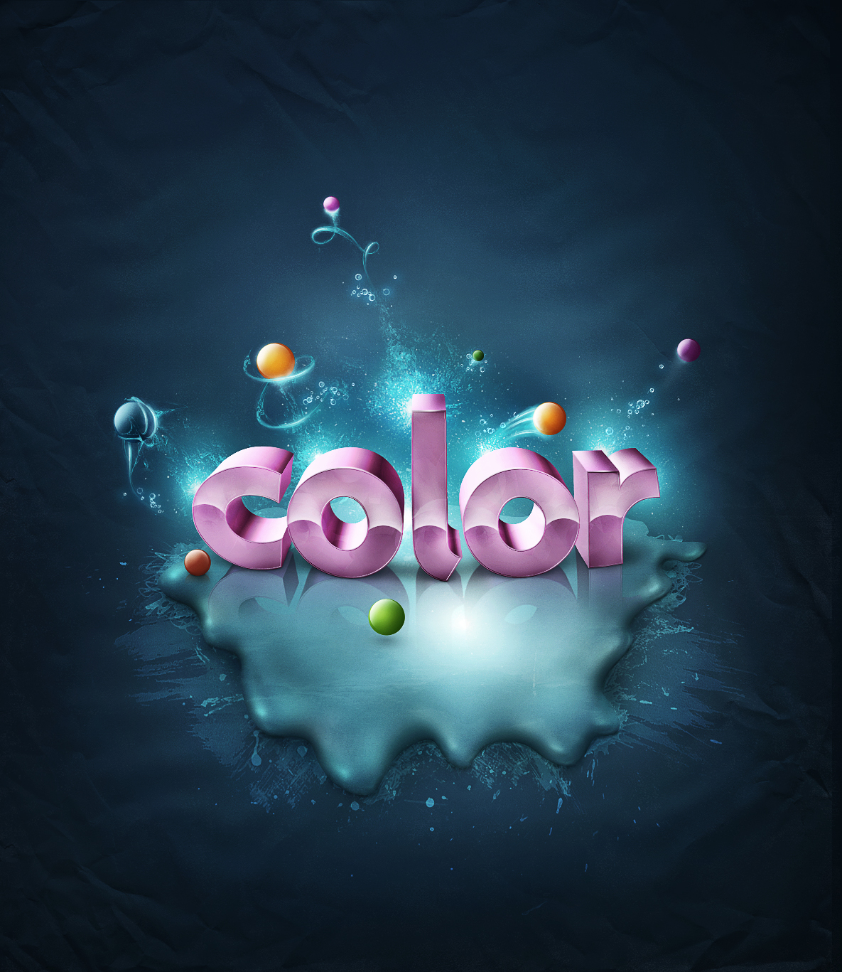
Final Image Preview
Take a look at the image we'll be creating by the end of this two Part series. You can view the final image preview below or view a larger version here.
Introduction and Preparation
This tutorial series is kind of a continuation of the tutorial Super Malleable Lines. There are some similar effects shown here, but from a very different angle. In Part I of this tutorial, we will focus on how to create 3D text and the splatter effect.
First of all, to create the 3D text, you need to download the demo version of Xara 3D6. You may use Adobe Illustrator as well, but I strongly recommend you get Xara for this piece. Also download the stained metal texture image we'll be using from cgtextures.com.
Step 1 - How to Begin?
The best way to start a colorful art piece is finding the right colors. In the Super Malleable Lines tutorial, the colors of the background were sunny, so this gave us a warm impression. Here we'll move more into cold tones.
Let's start with opening a new document of around 1350 pixels by 1600 pixels with a resolution of 300px/inch. Create a new layer and make a short color matching. Don't pick the first color you choose, try to play around with some different tones. People often destroy their works with bad looking backgrounds.
So now that we found a good fitting color, grab the Paint Bucket Tool (G) and fill the new layer with #166a91. Name this layer "background."


Step 2 - Background Depth
Now what we need is to give this background some life. Again, spend some time on searching colors, try to get some proper cool tones. What I'm talking about is finding darker and lighter tones of this blue color. The colors that I used are shown in the images below.
If you already picked some good darker color (or if you have some problems with colors refer to the images below - I showed the specific color used). Grab the Brush Tool (B), set the Flow to 5%, Hardness to 0% and make your diameter very big as you see below. Create a new layer, name it "bg_color" and paint in the corners with this big brush. Make each brushing of new color on it's own new layer.
Try to paint in different spots, basically make the edges darker and the middle brighter. This way you will receive some irregular gradients and that's what we want.


Step 3 - Adjusting Color
When you're done with coloring the background make sure everything works for you fine. The colors seemed a little too bright for me, so I decided to go to the Layers Palette and I added a new adjustment layer of Hue/Saturation above all the layers. Then I slightly decreased Saturation, removing some color.


Step 4 - Preparing Texture for Splatter
Now open some stained metal texture. I don't know why is this called "metal," seems to me like some stains. Anyway, stains are the point, you can pick an image of your own choice. It must be suitable to your needs.
Now hit Command + T, use Distort to make a perspective of this picture. Then hit Command + Shift + U to desaturate. Command-click on this layer's thumbnail to call the selection. Copy it using Command + C.


Step 5 - Creating Splatter, Shape and Shadows
Get back to our main project document. Grab the Pen Tool (P)and draw a splatter shape, then turn it into a selection. Create a new layer above all, name it "texture." Now go to Edit > Paste Into. Our texture should now dynamically be pasted into the selection, it means you can change its position inside the selection. Now change this layer Blending Mode to Overlay and set the Opacity to 70% and your project should look like the second image below.
Now create a new layer above all and name it "splatter shading." Grab the Brush Tool (B) and change the color to #125361. Make sure your brush settings are very soft, something like Hardness 0%, Flow 10%. Now make the selection of the texture layer (Command-click on the layer's thumbnail). Take a look at the third image below and paint in the indicated spots. We need to darken the inner curved parts of this splatter to create a convex look. This splatter needs to pop up a little, to be not so flat. Refer to the 4th and 5th image below.


Step 6 - Creating Splatter: Lights
OK, now as you created some shading, let's move to lights. Look at the first image below. I made a small preparation (this is not something you need to do). Before you add lighting you need to imagine how it would look like if it was real. So I created several simple lines to show you which places are good to set the lights.
If you're ready, then create a new layer above all and name it "splatter lighting." Call the selection of the "texture" layer. Now with the same brush settings and a brighter color #99e9ea, start painting in the indicated spots (keep a small space from the splatter edge).
Note: Remember that you're able to make changes anytime you feel something is not right, so if you give too much shade or lighting, help yourself with the soft Eraser Tool (E) to erase unwanted parts.


Step 7 - Creating Splatter: Brush Settings
Before we move further, go to the Brush Palette and change the brush settings, as shown below.
What's this for? Using a small, soft and faded brush you can easily paint with a mouse. If you paint in one spot, you're allowed to make some failure lines, as they will be barely visible. Refer to the second image below, and look how the light lines are being created. In the third image below there are white arrows that indicate where to paint. Add these light lines on each outer curved edge of the splatter.


Step 8 - Creating Splatter: Adding Lights
Now, don't change your brush settings, only increase the diameter a little and change the color to white. Then create a new layer above all, name it "lighting overlay." Set this layer's Blending Mode to Overlay, and start painting in the same spots that were indicated in Step 6. Create only little spots, not lines.


Step 9 - Creating Splatter: Adding Lights More
Continue adding lighting on selected splatter parts. Remember to work dynamically with your diameter. You can go from bigger to smaller to create nice spot lights.
Also help yourself with the Eraser Tool (E) and a very soft eraser, something like 0% Hardness and 8% Flow. Take your time while working on the details.


Step 10 - Creating Splatter: Touch Ups
Next, create a new layer above all, name it "splatter touch ups" and change it's Blending Mode to Multiply. Reset your brush settings. Then set the brush to Hardness 0%, Flow 5%, change the color to #125361. Now look at the first image below and darken in the indicated spots just a touch. Then switch to a white color, create a new layer, name it "splatter light," then use the same brush settings to add some more light to this splatter.


Step 11 - Shading Process Explanation
Before we move to creating splatter shadow, here are a couple things you need to understand:
- If you want to put an object in 3D space and place it on the surface, you need to pay attention to where is your light source (or sources).
- Remember that objects also drop shadows below themselves (refer to the image below, "the shadow between box and desk"). This is something many designers forget (or don't know) about it.
- This means that sometimes one object may have fewer shadows depending on light sources and where it's placed.
- Also keep in mind that the "darkened area" (refer to image below) of objects always remains darker than other parts.
- And it's the same for the "lightened area," it's lighter than other parts of the lightened object.


Step 12 - Creating Splatter: Shading Process
We have not specified the source of light in this work so we will skip the shadow caused by the source light. We will only take care for the shadow below the splatter (refer to pointer 2 in the previous step).


Step 13 - Splatter Shadow
Now there is only a slight difference between splatter with shadow and without it. But it's OK for now. In Part II of this tutorial, we will make this surface more dirty and this will give a stronger shadow effect.
We're almost done with it, but before we move further I want you to look at the third image below. Maybe you're wondering why these spots have no shadow? The splatter looks like a 3D object, so if you had it in 3D program you could rotate it seeing how each side looks. Now, if you could look at the splatter from the right side, the shadow would be there. But from our point of view (front) it's just not visible, so we don't add it.
It's kinda hard to explain, sometimes you just need to imagine how it would look like in reality.


Step 14 - Text Preparation
OK, once we're done with the splatter, we can move further to creating text. But before you do this, let's take a look at the first image below. As you see, not the whole splash was covered with lights and shading. The area indicated with the pink color looks unfinished. It's OK, because I planned this illustration from the beginning to create a text in the middle. So the text should cover some imperfections of the back.
The second, third and fourth image below are a little show of how I basically planned to do the text. I made a small preparation as I didn't exactly know how this should look. This isn't something you must do, but sometimes it's good to experiment. So now when this flat text occurred a lot of ideas came to my head. This pretty much helped me to see what I want to achieve.


Step 15 - Text in 3D Space
To put 3D text on a surface in 3D space you need to set the horizon line. Take a look at first image below. My base was the splatter I created. In our case the horizon line should be a little above the top edge of the splatter. You don't have to draw these lines like I did in the first image below, just try to imagine where this line should be.
This isn't necessary in some abstract pieces where for example: letters are flying in the air, as they can rotate.
Before we move on to creating the 3D text, you need to also understand the position of letters: take a look at the second image below. If the letters lay below the horizon line, then remember that you look at them from the top, and this is the way we will create our text.


Step 16 - Preparing Text in Xara
OK, finally some action. Open Xara3D 6. And as I said before keep the top of the letters visible. Xara is very easy to use, if you spend around 5 minutes you will get to know everything.
In the images below I indicated some more important options that were used here to generate this text. I recommend you play around with your own settings. But if you want to achieve something similar to mine, then the colors used here are:
- Light 1: #FBDBFF
- Light 2: #EF72D2
- Light 3: #E35DB0
The rest of the color options stay untouched.


Step 17 - Saving Text
People sometimes forget about a few things in Xara3D 6:
- Before you save your project, go to Shadow options and turn off Shadow (we don't want to be bothered with Xara's original shadow, which looks pretty bad).
- Then to save the file to a Photoshop readable format, go to File > Export, select PNG format and save the image with the same settings, as shown in the second image below.


Step 18 - Adjusting Text
OK, we saved the text in PNG format so it's transparent. Now open the text in Photoshop and drag it into our project. Then hit Command + T (Free Transform) and select Warp. Try to make this text less straight and more rounded like it was circling. It gives a better 3D feeling.
Next refer to the third image below: grab the Burn Tool (O), set the Range to Midtones, the Flow to 25% and paint a little on the bottom of each letter (later this will help achieve a better shadow effect).
After this, correct some tones of the text using Layer > Adjustments > Selective Color (forth and fifth images below). This is up to personal taste. Try to adjust mostly Reds, as this option will mostly affect your pink text.


Step 19 - Text Touch-Ups
OK, now take a look at the first image below. I have indicated some places that look pretty bad. This dark color doesn't exactly fit our illustration. Beside, the red arrow indicates a spot that Xara kinda destroyed, this looks dirty. We're going to touch up all these spots.
So first grab the Pen Tool (P) and draw a path on the worst looking spot of this text (it's indicated by a red arrow). Turn this selection on (right-click > Make Selection). Then select the Clone Stamp Tool (S), refer to the third image below. Make your settings the same as mine (also set the Hardness to 0%). Then touch up this bad looking spot. And it's good to do this on a new layer.


Step 20 - Text Touch-Ups: Brightening
OK, now let's take care of the rest of the bad looking spots. Create a new layer above the text layer, you can name it "text correction" and change its Blending Mode to Overlay. Grab the Brush Tool (B), change the brush settings to Flow 10%, Hardness 0%, and give it a big diameter. Now pick #ffbdf3 for the color. Next hold Command-click on the text layer thumbnail to call the selection of this text. Then make a soft brushing on the spots that look too dark.
The main task is to pick a bright pink color (that matches the color of your text) and cover some imperfections using overlay blending mode. You can even go through some random spots of text faces, this will give a nice tonal variety to the text.


Step 21 - Creating Gloss
Now let's take care of the gloss. I wrote everything on the images below, you should be able to easily follow them. The main thing about this is to create a soft gradient from the middle of these letters heading to the top.You can do this the way you're comfortable with, although I think the way shown below is pretty cool and fast.


Step 22 - Creating Inner Reflection
Let's move to creating some depth. These letters look OK for now, but it's nothing special yet. We need to give them a more unique look. We're going to create an illusion that the text is reflecting something from the environment. And the thing is no one cares whether the reflection is showing real objects or fake ones, as long as it looks good.
So Command-click on the text layer thumbnail to call the selection of this text. Then hit Command + Shift + C (Copy merged) and Command + V (Paste). Now we made the exact same duplicate of the whole text. Name this layer "Reflection 1," make a few duplicates of this layer and name them in order "Reflection 1," "Reflection 2," and "Reflection 3."
Now grab one of the reflection layers, hit Command + T (Free Transform), and rotate it as you see in the first image below. Then call the selection from the original text layer (second image below). Go to Select > Inverse and hit delete (remember to select the transformed reflection layer while you're hitting delete). You should get something that looks similar to the second image below.
Then change the reflection layer Opacity to around 15-20% and set its Blending Mode to Overlay. You should get something similar to the third image below. Make sure the reflection stays only in the text faces, so if it goes somewhere to far use a soft eraser to make the touch ups (forth image below).
Repeat the reflection process around 2-3 times until you cover the whole text (carefully, don't get to messy). Refer to the fifth image below, you should get something like this.


Step 23 - Gloss and Reflection Correction
Now we'll make the gloss and reflection effect even stronger. Grab the Eraser Tool (E), set its Flow to 5% and Hardness to 0%, then make a small erasing around the gloss of each letter (where the white arrows indicate). Then switch to the Burn Tool (O), set the Range to Midtones and Exposure to around 20%, and add some depth to each letter (where the red arrows indicate).


Step 24 - Text Touch-Ups
Now let's solve some lighting problems. Obviously the text is mostly lightened from the top-left (first image below). You can see that the top-left side of these letters is brighter than the right side. Of course there area few light sources on this text because the front is also bright, but let's focus on the strongest light source.
Look at the second image below, it looks like we're missing something. The rest of these letters have a nice light and shade, but the top of the letters "L" and "R" almost completely lack shading. It's probably caused by the light from Xara. I guess it was too low to reach the top of these letters. But it's no problem, we're going to fix it, as it will look much better afterwards.
So call the selection of the text layer (third image below). Grab the Brush Tool with the same settings as previously (Hardness 0%, Flow around 5%), change the color to the some darker pink (#79185d). Create a new layer above all, name it "additional shade" and start painting by the right side of the top of these letters, refer to the third image below.
Next create new layer above, name it "additional light" and repeat the same process but this time from the left side of these letters (refer to 4th image below).
Note: Always remember to help yourself with a soft eraser if something doesn't go right.


Step 25 - Text Touch-Ups
Go to the Layers Palette and create a new adjustment layer Gradient Map above all the layers. Select the gradient from Black to White, and you should have something similar to the first image below. Then change the Blending Mode of this layer to Soft Light, and lower the Opacity to 70% (second image below).
Finally call the selection of the text layer, go to Select > Inverse. Then go to the Layers Palette and select the Mask of the Gradient Map layer. Once you do this, grab the Paint Bucket Tool (G), change the color to black and fill the Mask (third image below).
And what did it do? Now we're sure that this gradient map affects only this text, nothing outside it.


Step 26 - Text Touch-Ups
Now it's a small detail, but I like to add this. Change you brush settings to Hardness 100%, Flow 100%, then grab the Pen Tool (P). Create a new layer above all, and make a curve or straight line on the top of each letter like you see below.
When you're done, right-click and select Stroke Path. Make sure option Simulate Pressure is checked.


Step 27 - Creating Text Shadow
I guess the hardest part of all is always adding shadows. OK, first of all let's make a standard shadow between the splash and letters.
Before you begin, remember that it's good to treat shadows with the same color that the surface has but in different tone. So our splatter surface is a light blue color, then for the shadow choose a dark blue color (something like #092330). Now grab the Brush Tool (B), remember to have Hardness set to 0%, and the rest of the options you have got below.
Create a new layer below the text layer and name it "text shadow." Start with a small diameter and add tiny shadow lines exactly below the letters. Make your diameter bigger to fill the empty spaces between the letters.
Note: Always help yourself with a soft eraser!


Step 28 - Final Adjustments
We're heading to the end of Part I of this tutorial. I usually play around with some overall adjustments when I'm about to finish. So go to the Layers Palette, create a new Gradient Map adjustment layer, select the "Violet, Orange" preset and click OK. Then change this layer's Blending Mode to Soft light and lower its Opacity to around 20% (this will give a little more warmness to this piece).
Next repeat this process but this time create a Gradient Map from dark blue (greeny black) #202930 to a lighter color (even turning into grey) #31505b. Set this layer's Blending Mode to Soft Light and Opacity to around 80%. This will increase some color and contrast.
This text still looked too cold for me so I decided to create another Gradient Map using the same process. This time I used colors from #2e2111 to #e2be84 (third image below). These are some browny, yellowish colors to add some more warmness. And again change this layer's Blending Mode to Soft Light and its Opacity to around 30%.
And finally you may add Curves adjustment layer if you like. This is not necessary, but I think the dark and contrasted tone gives a nice feeling. You can also play with the Red Channel in Curves to give the text color a more desired look.


Step 29 - Final Touch-Ups
After adding a few gradient maps I decided to move some light parts (indicated by white arrows). I also made a small shadow correction as it seemed too dark and dense.
Also as you can see in the second image below, I lowered the opacity of shadow between the text and splatter. It's just because curves made it a little bit too dark.
Be ready for any corrections, after adjusting colors and contrast sometimes you may wanna change something. And it's good to take a fresh look at your piece and work on some details if they don't fit correctly.


Conclusion
So now you know how to create a cool splatter from scratch, add glossy colorful 3D text. Fill the whole image with great colors and place everything in 3D space. I think there are many useful effects and techniques you can use in your own projects.
And this way we have reached the end of Tutorial Part I. Although this piece needs some more detailed work all over it, as it is too empty. So in Tutorial Part II you will learn about some nice techniques for achieving glowing effects and creating a creative messy look. Check it out soon!
Thanks for reading the tutorial. You can view the final image of this two part series below or view a larger version here.


